Results

Learn More...
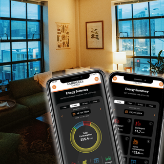
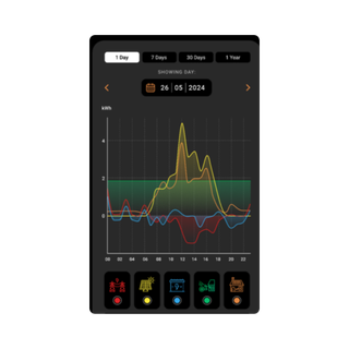
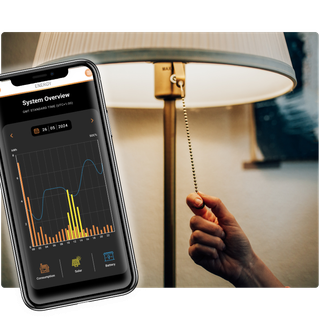
About the Duracell Energy App
Learn how to maximise your system using the data available in the Duracell Energy app.
About the Duracell Energy App
Keep up to date with our product news, industry news, special offers and much more.